THE SUBTLE COLOURS OF JAPAN - A Palette Like Nowhere Else
After two weeks traveling through Japan — spending time in Osaka, Sapporo and the wider Tokyo area — I found myself photographing not just a country, but an entire colour palette.
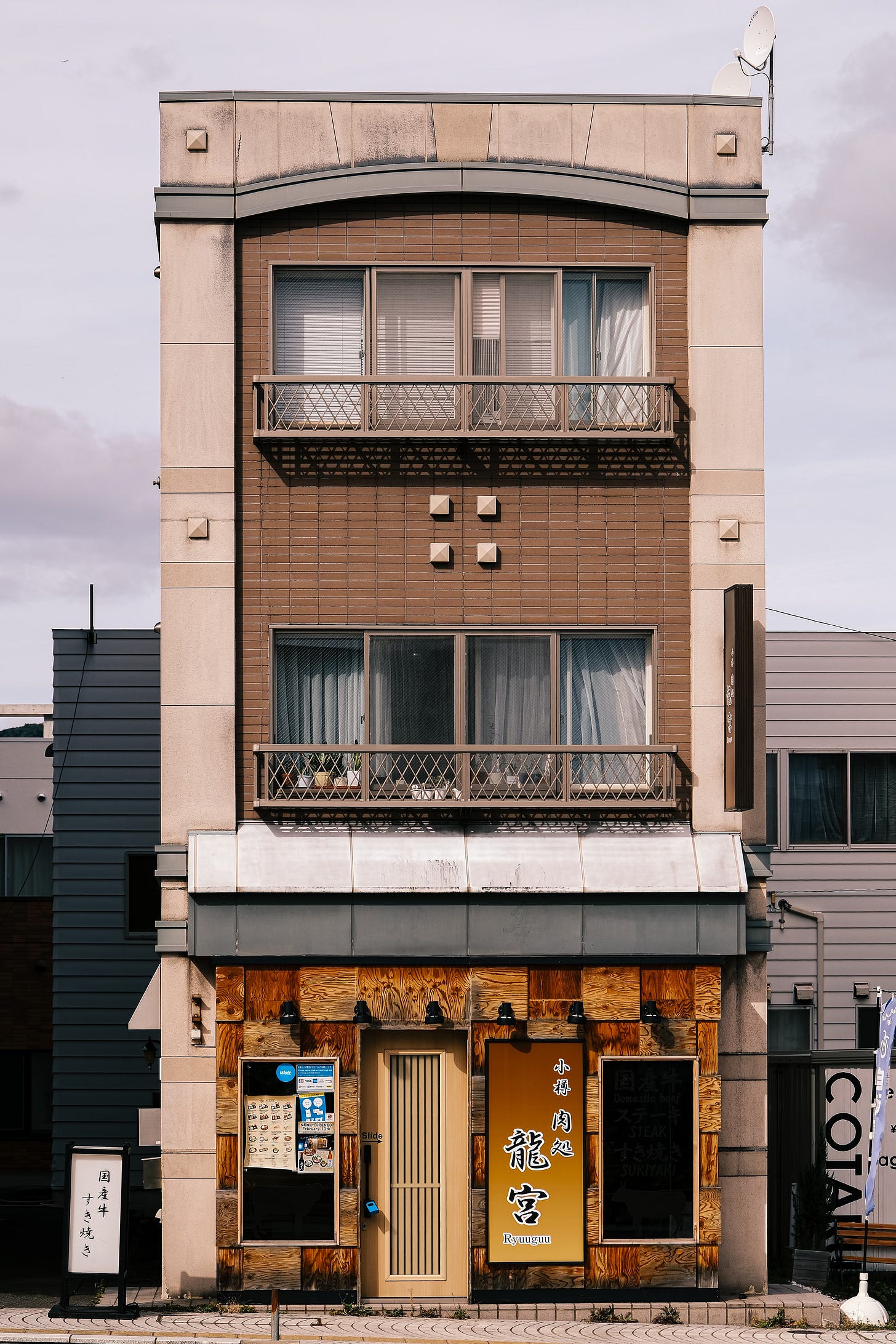
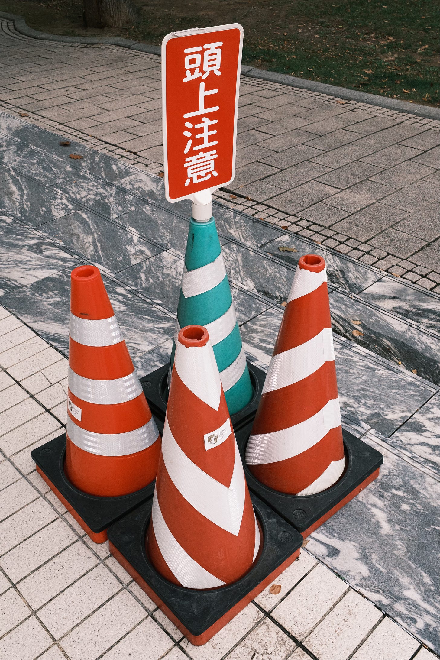
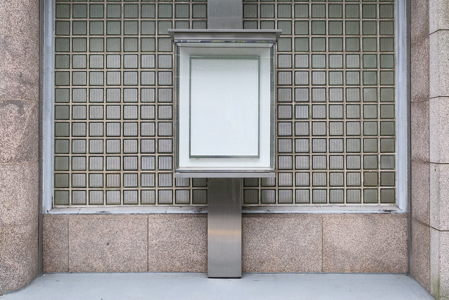
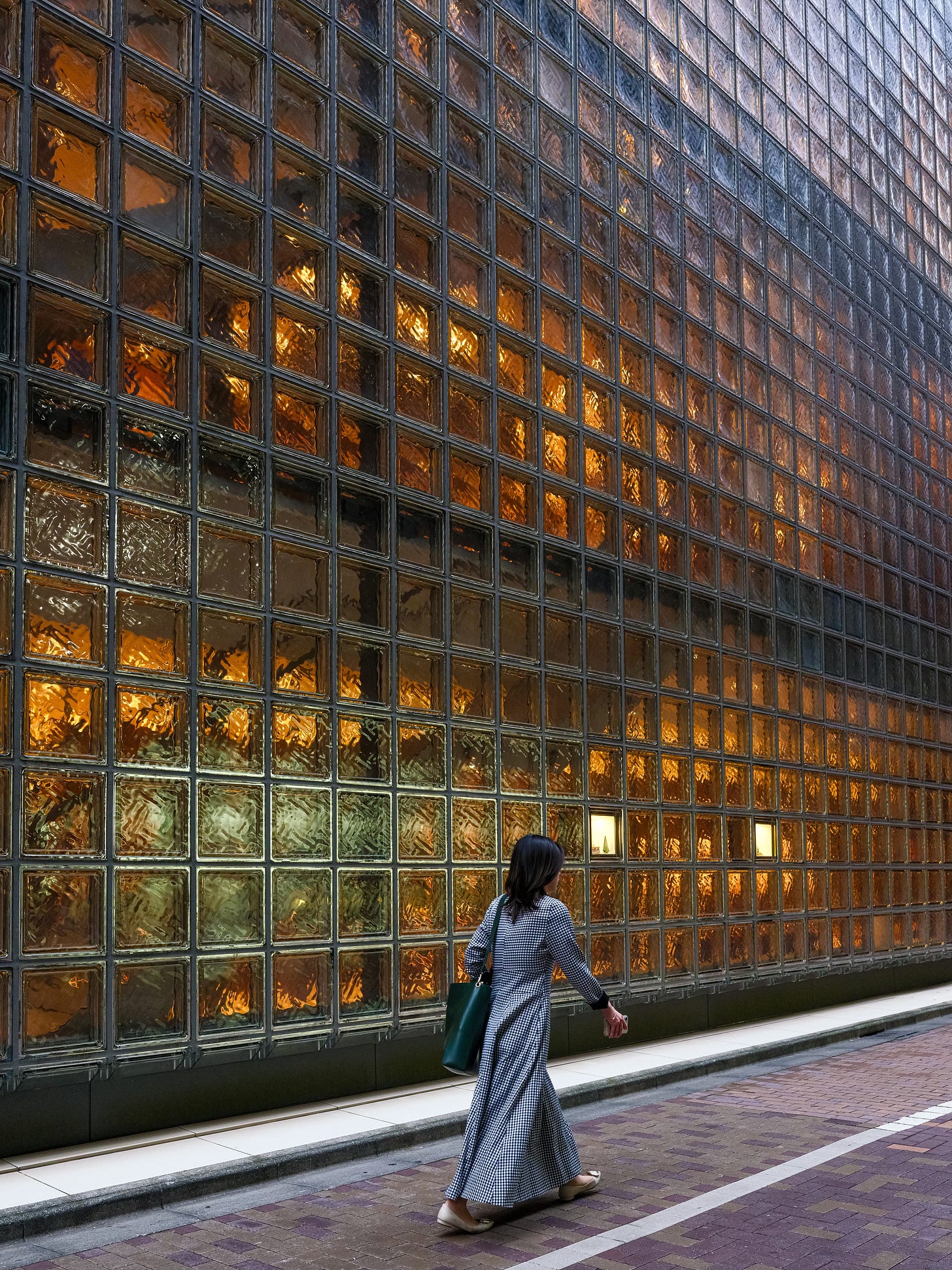
Japan has a very particular way of revealing colour. It’s as if everything has been gently softened: the reds less harsh, the blues less cold, and the greens brushed with a hint of grey. The tones I encountered felt almost pastel, yet alive — subtle rather than muted, deliberate rather than faded.
What struck me most was how balanced everything felt. In Japan, colour rarely overwhelms; it coexists. Even in the busiest street, there’s harmony between the tones — the grey concrete, the soft white signage, the warm light spilling from a ramen shop. It’s as if the country’s design language has long mastered the art of restraint.
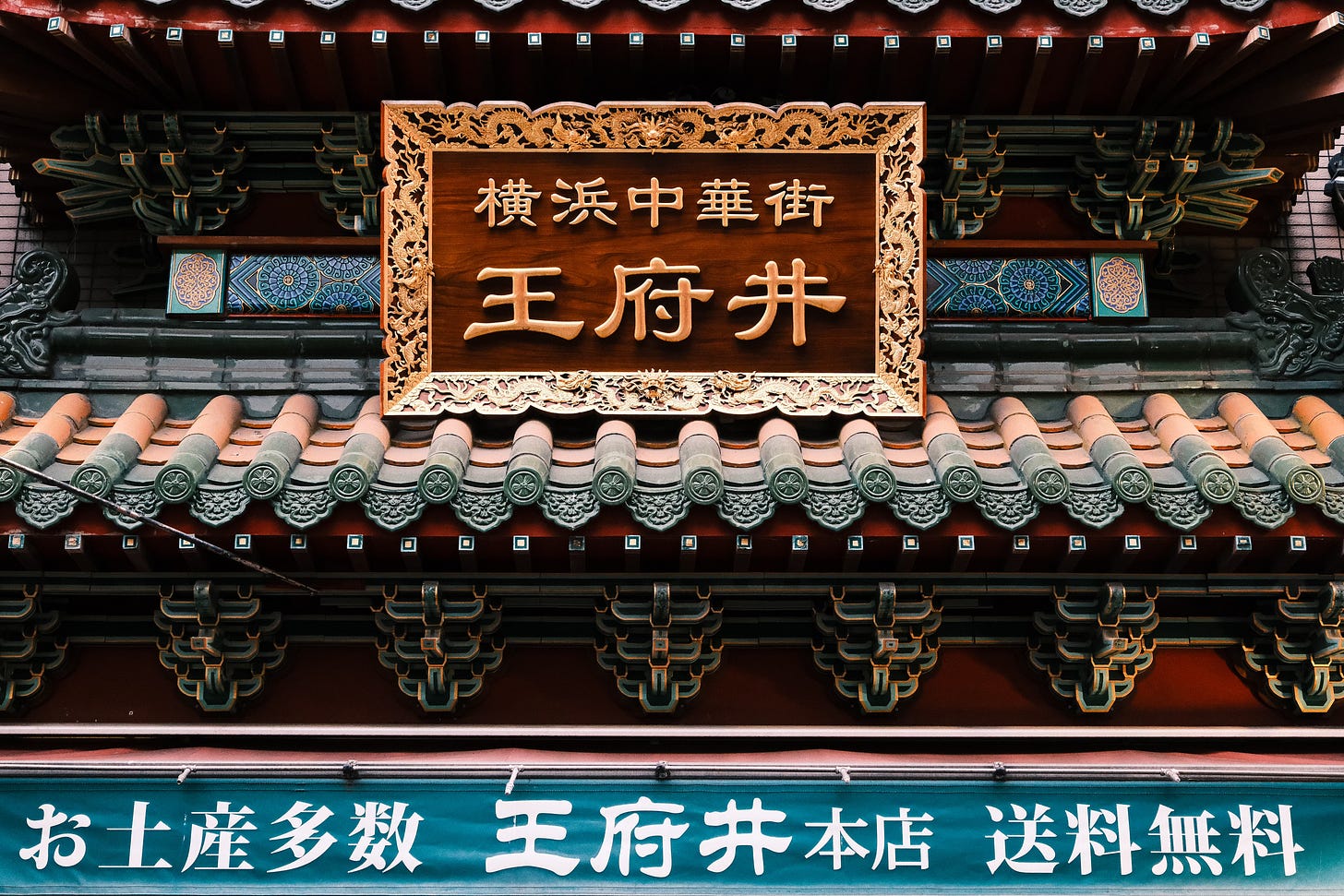
This sense of harmony runs deep in Japanese culture. You see it in the weathered wood of shrines, in the earthy browns of tea houses, in the quiet greens of moss gardens. The concept of wabi-sabi — beauty in imperfection and impermanence — seems to govern not just design but the entire visual landscape.
Colours feel lived-in. They carry the marks of age and time, which makes them feel more human, more approachable.
The Light That Shapes the Colour
The secret, I believe, lies in the light itself. Japan’s atmosphere seems to filter everything through a natural diffusion. In Hokkaido, the northern air has a cool, silvery quality, softening the shades of blue and ivory.
Down in Tokyo or Yokohama, humidity fills the air, wrapping the streets in a gentle haze that blurs edges and mutes contrast. Even midday light feels less harsh than in most other parts of the world.
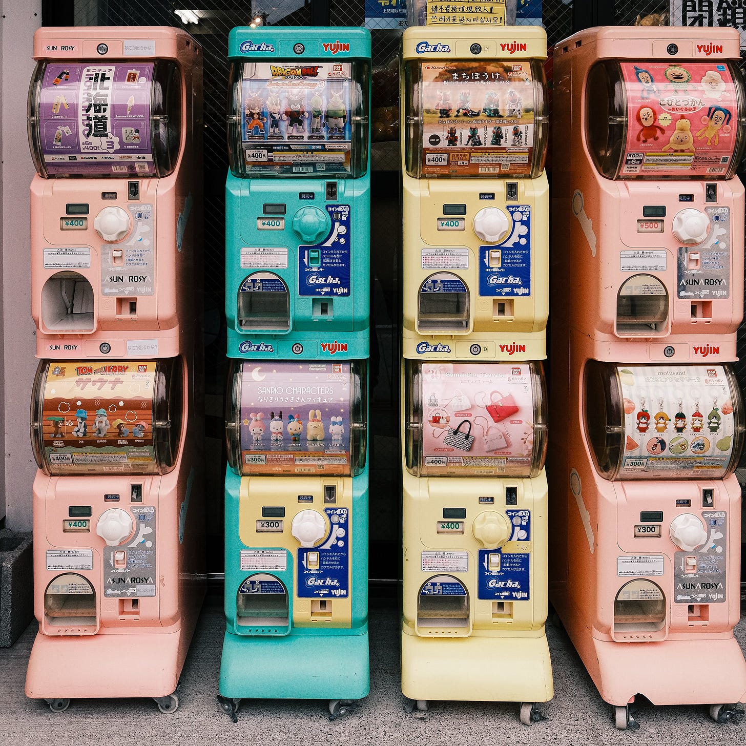
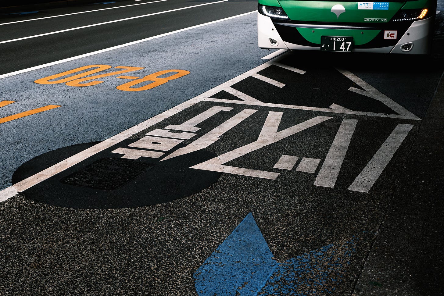
For a photographer, this is a dream. I found myself shooting more freely on overcast days, when the sky acted like one giant softbox. The pastel facades of backstreet cafés, the pale tones of vending machines, and the reflections in wet asphalt — everything blended into a subtle gradient of tone and mood. Japan’s light doesn’t shout; it whispers.
Learning to See Differently
Travelling through Japan changed how I look at colour. I realized that restraint can be more powerful than intensity. When you slow down — when you really look — you begin to see the depth in the quiet tones: the soft grey of a morning train platform, the faded red of a torii gate, the cool blue shadows beneath a bridge in Sapporo.
I started underexposing slightly, letting the light wrap more gently around the scene. The results were images that felt truer to what I experienced — calm, balanced, and atmospheric. Japan teaches you to be patient with colour. To wait for it to reveal itself, softly, over time.
Fujifilm Film Simulations - Classic Negative and Classic Chrome
Fujifilm’s film simulations Classic Chrome and Classic Negative, seem tailor-made for Japan’s delicate palette. Both bring out that understated mood the country is known for — the quiet in-between tones that exist somewhere between light and shadow. Classic Chrome softens contrast and mutes saturation, lending images a timeless, documentary feel that beautifully complements Japan’s urban hues and overcast light. Classic Negative, on the other hand, adds a touch of nostalgia with its subtle cyan shadows and warm highlights, perfectly echoing the pastel tones found in old storefronts, faded signage, and softly lit streets.
Together, they transform Japan’s already gentle colours into something cinematic — a visual poetry that feels both contemporary and steeped in memory. Most of the images shows here were shot using Classic Negative.
The Beauty That Lingers
Two weeks were not enough to fully understand Japan’s palette, but they were enough to know that it’s unlike anywhere else. The colours of Japan are more than aesthetic choices — they’re an expression of culture, of humility, of transience.
In a world where digital screens and filters constantly push us toward intensity, Japan reminds us that beauty can be quiet. Its colours don’t demand attention; they invite it. And once you’ve seen the world through that lens — soft, pastel, and profoundly balanced — it’s hard to look at colour the same way again.
BJORN




Comments